Speed and acceleration
One loyal reader, sitting next to us at nationals, asked: Is it my imagination or are times not just getting faster, but getting faster at a rate we have never seen before?
We love this question. This is both a question about absolute speed and about the rate of change in measures of that speed. We think we can answer this question but we need you to come along with us on a little journey.
Obviously it is impressive how many records have fallen in the last couple of years, but if we were seeing uninterrupted incremental improvement in the fastest swims every season, then we would not have all these old records.
Do you want to build a strawman…?
For purposes of illustration, let’s formulate a prediction statement that we know is wrong but will at least give us a baseline: If we look at the fastest time in each individual women’s events, that time will get faster with every passing season.
Right, so first we have anecdotal evidence this prediction statement is wrong—just look at the records above.
And something more than anecdotes: the R-squared value of that prediction is really low.
R-squared (a brief reminder, because we are all busy)
R-squared is a calculation yielding a number between 0 and 1. That number tells you how well a model explains or predicts the differences you see in real-life data, with 1 meaning perfect prediction and 0 meaning the model doesn't explain anything at all.
Because we only have two variables (in this case, season and fastest time in that event), R-squared will measure how well one variable (a new season) explains the variation in another (fastest time in that event).
0.147
If there were a strong trend of setting new records in each individual women’s event every season, the R-squared value comparing each season to new fastest times would approach 1.000. Instead, we find an R-squared of just 0.147. That is awful close to zero (no trend).
0.337
This same number is twice as high in men’s individual events: 0.337. If you wanted to say it indicates low or weak (but still positive) correlation, that’s probably defensible. But…like, in the end, the whole world correlates at 0.3, so let’s not fixate.
We are not being (intentionally) dense.
We know this is a strawman argument producing predictable results. Predictable in that we all sense that as athletes approach their physiological limits, new absolute records will be set infrequently and improvements will get smaller and more incremental (teeing up one of our all-time favorite footnotes).1
So let’s stop looking at fastest times, and instead look at something more reliable.
The 100 fastest swims per event per season
We collected the 100 fastest times per season (2013-2025) in each event. Then we looked at the 100th fastest time, and the median time in that set of 100 swims.2
And by those measures, Division III swimming times are basically getting faster in every event, every season.
For instance, look at women’s 100 Back.
MIT’s astonishing Kate Augustyn—who already had the Division III 100 Back record—lowered it further this season at her conference meet. Her time was (of course) faster than the fastest time in 2013, so the dashed orange line extends further down the vertical axis than the blue solid line.
But for our purposes, the interesting comparison between the two seasons is happening further up the curve, at the median and in the 100th fastest time recorded.
Look at that gap between the solid blue line and dashed orange line. The 100th fastest time in 2025 is significantly faster than the median time in the event in 2013. Meaning the 100th fastest swim in 2025 was way way faster than the 50th fastest swim in 2013.
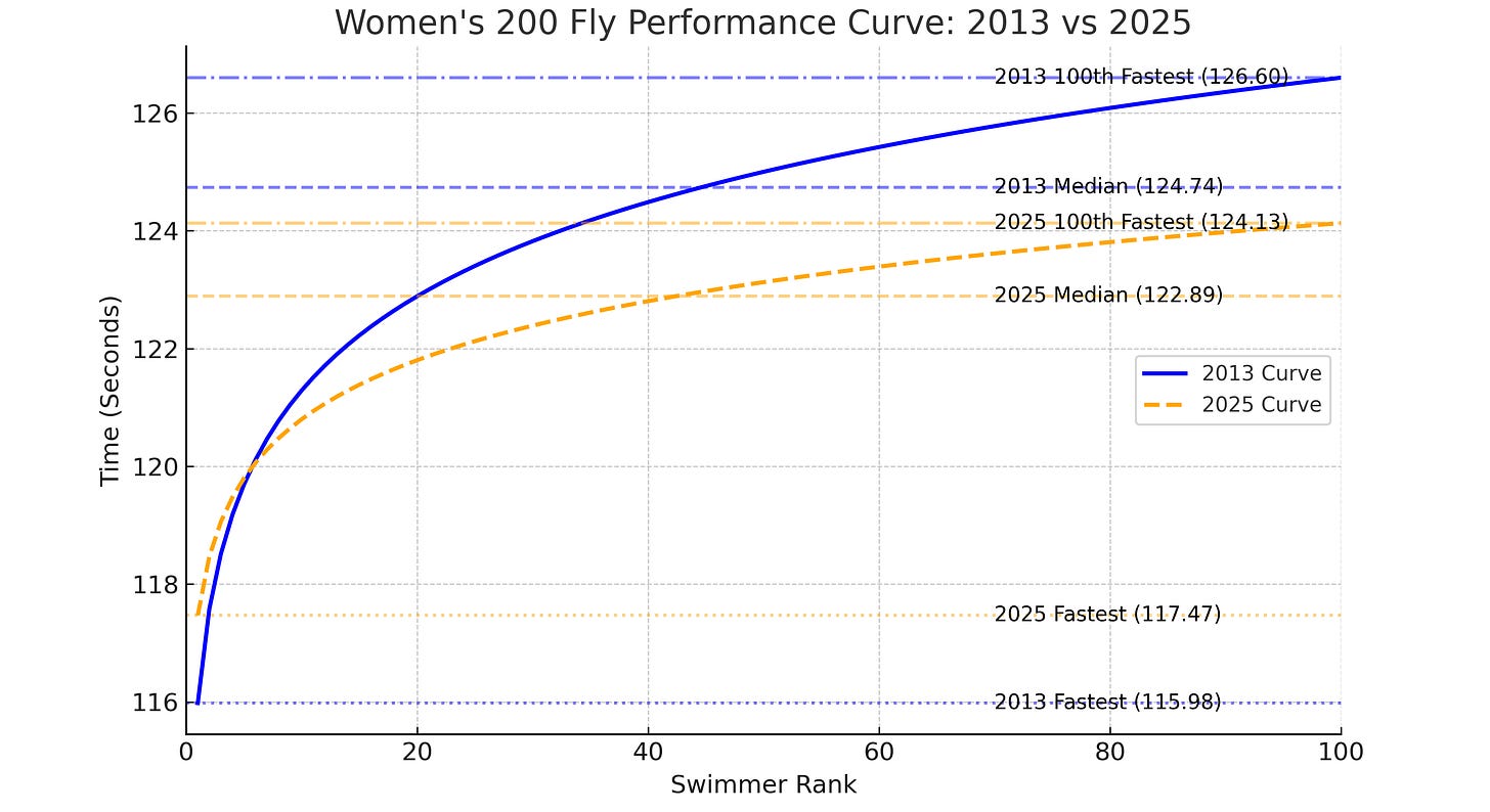
How about women’s 200 Fly?
In 2013, Kenyon’s Hannah Saiz went 1:55.98, a serious challenge to the D3 record Logan Todhunter of Williams set in 2012 (1:55.66—a record that still stands).
The fastest time from the 2025 season was set by Sophia Verkleeren (#legend) at her conference meet—1:57.47. Blindingly fast, but still a bit off the 2013 time.
Yet the median and 100th fastest times for 2025 are much faster than in 2013. This pushes the orange line down the vertical axis, and then the lines cross as they chart the fastest time in each season.
Once again, the 100th fastest time in 2025 is measurably faster than the median time in 2013.
We can trot out chart after chart, event after event, men and women. It is the same story over and over again.
Back to R-squared
If we do the same R-squared calculations on the 100th fastest time in each event and the median time, we get a much more compelling result.
Much better. Those are just really high values. Even the lowest one—the median swim in women’s events—is an incredibly strong signal.
Look, there’s a lot of nerdy stuff we could talk about right now.3 But we still have to answer the second part of the question.
Acceleration or mirage?
A little of each, we think.
Rate of improvement in the fastest swim
Acceleration: In women’s events, the rate of improvement in the fastest swims—compared to the previous year—was higher than in any other year since 2013.4
Mirage: In contrast, men’s events saw only average gains. Since 2013, the median year-over-year improvement in men’s fastest times is -0.10% (with negative values indicating faster swims); this season it was -0.14%—a marginal difference, imperceptible to the eye.
Rate of improvement in the median swim
Acceleration: In women’s events the rate of improvement in the median swim—compared to the year before—was greater than in any year in our study. The only year really comparable was 2022, the first nationals post-COVID.
Mirage: In men’s events this season, the rate of improvement in the median swim was -0.18%. The median improvement in the median swim since 2013 was -0.18%.
Rate of improvement in the 100th fastest swim
Acceleration: In 2025, in women’s events, the rate of improvement in the 100th fastest swim—compared to the year before—was greater than in any year in our study except 2022.
Mirage: In men’s events this season, the rate of improvement in the 100th fastest swim was -0.20%. The median improvement in the 100th fastest swim since 2013 was -0.19%.
We wonder if ‘mirage’ is quite the right word. Consider the men’s 50 Free championship final: overall, the field improved by just 0.07 seconds from last year—a margin too small to easily perceive. Yet, even these tiny increments become dramatically visible as competitors approach a key threshold—in this case, breaking the 20-second barrier. Thus, what started as a nearly invisible improvement translates into something unmistakable: noticeably more swimmers posting times beginning with a "19."
Take Olympic marathons as an example. Early in the Olympic movement, significant improvements in running records were common because athletes were far from their biological potential. But as performance improved, athletes approached the "left wall" of human capability—genetic, physiological, biomechanical constraints—and as they drew closer, the margins of improvement shrank dramatically.
19 minutes: From 1908 to 1912, men’s Olympic marathon winning times dropped 19 minutes and 36 seconds from John Hayes's 2:55:18.4 (USA) to Kenneth McArthur's 2:36:54.8 (South Africa).
10 minutes: From 1956 to 1960, Olympic marathon winning times dropped by nearly 10 minutes, from Alain Mimoun’s 2:25:00.0 (Algeria/France) to Abebe Bikila’s barefoot victory in 2:15:16.2 (Ethiopia).
4 minutes: The last significant drop came between 2004 and 2008, when the Olympic marathon record improved by over 4 minutes.
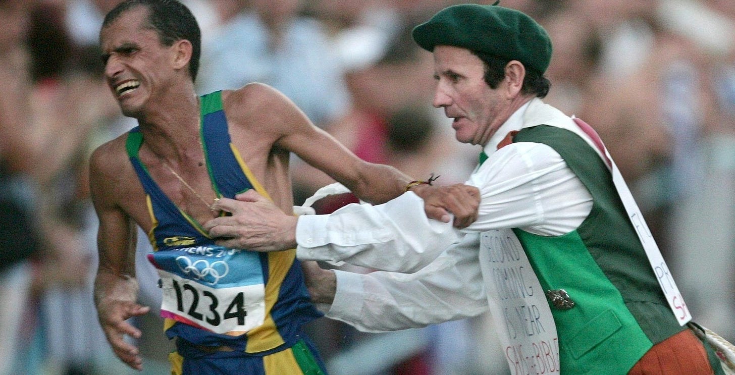
In 2004, Stefano Baldini of Italy won Olympic marathon gold (his time was 2:10:55) after Brazilian Vanderlei de Lima, who was leading with just three miles left, was attacked by Cornelius Horan, a former priest dressed in a green beret, red kilt, knee-high green socks, and wearing—on his front and back—homemade posters bearing apocalyptic statements.
De Lima recovered and finished third, later stating that the frightening incident—during which he believed he might be killed—"cut my rhythm."
In 2008, Samuel Kamau Wansiru of Kenya ran unobstructed, further improving the winning time to 2:06:32.
The median is the middle value in a sorted dataset and is a good measure of central tendency because it is not skewed by extremely high or low values (outliers).
Like if we were looking at this as a standard distribution of times, what does it mean to have the measure of central tendency (median) and the right tail (100th fastest swim) steadily marching in the direction of a more or less static left tail?
To be clear, we're comparing a specific time (fastest, median, 100th fastest) in each event this season to the comparable time in the same event last season. Then, we look at how this season’s overall rate of improvement stacks up against the rates of improvement from past seasons.


What happened to AUA #2?